3. Placing the USP and main message “under the fold”
I´m sure that it won’t come as a surprise but let me tell you something: only 30% of users scroll down. Only 30%! The part of your web page that is seen before scrolling, is called “above the fold” meaning that 70% of the users won’t even see your content if it’s placed under the fold.
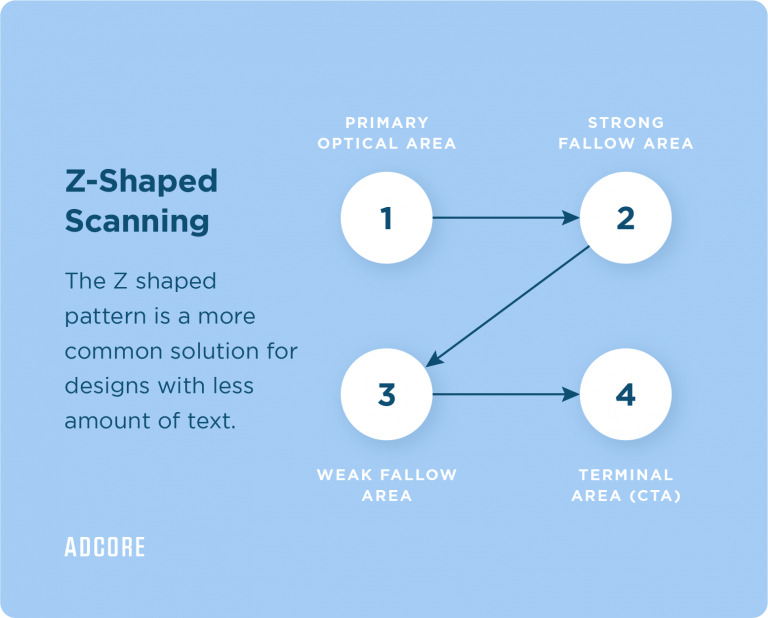
Therefore, make sure to place your USPs and CTA’s above the fold and leave the less important elements or contents under.
4. Unresponsive designs
When 40% of transactions nowadays are done using mobile devices, one website version for all devices is just not an option anymore. Thus, you have to make sure that your page will be responsive and compatible with all the different devices. We must give our customers the best UI experience no matter which device they’re using.
Imagine how unfortunate it would be if an enthusiastic user wishes to buy your product but couldn’t find the button to make the purchase. Yikes. To avoid this, just make sure to have a mobile version in place that is user-friendly, so the user’s path to conversion is as easy as possible!
Pro tip: There are plenty of useful hacks and tools to tell whether your site is adaptive or responsive. Just bear in mind that you might need some basic programming knowledge.
5. Not implementing tracking
Setting tags properly on your landing pages (and your website pages in general) is like putting on the right glasses for your eyes. You would never get the most accurate data of what’s really happening on your page unless you take this process seriously. With the right tracking, you will be able to understand your user’s journey much better and build your optimization based on it.
Proper tracking is much easier said than done, so if you are not proficient enough with tracking issues, you should consider external help.
Nonetheless, here are a few key tips to know that you are on the right track:
- Make sure you embedded Google Tag Manager on all your website pages.
- Make sure you set up conversions and goals correctly on Google Analytics and double-check that everything works.
- Make sure you are tracking all your ads and campaign activities that lead to your landing pages. Each platform usually has its own conversion tracking tags such as Facebook’s pixel, Google’s Global Site Tag, and so on.
Conversion tracking – Event vs. Thank you page
To measure the success of your landing page, you must know how many people completed the process and, in other words, how many conversions were generated by your landing page. There are two main ways that marketers use to track conversions. One is creating a ‘thank you’ page and the other is creating a conversion event on your Google Analytics.
So, which one should you choose?
- If you have a ‘Thank You’ page, use it! Create a destination conversion by implementing your conversion tag there. This will ensure that every conversion counted is 100% valid. Because if any detail was missing to complete the conversion such as a crash or an error, the user wouldn’t end up on the ‘Thank You’ page.
- If you don’t have a ‘Thank You’ page – You can create an event using a button click. It’s not a perfect solution as every button click would be counted as a conversion, even in the case of an error in a form, etc. However, it will definitely be a valid solution for websites without a ‘Thank You’ page.
Whether you chose a destination conversion or event setup- run a conversion test. Make sure the tag is being fired in the right place, and only there!
Pro tip: There are external tools you can use to check your LP performance. For instance, Hotjar is a great tool to check the users’ journeys on your LP! You can see heat maps of the user on your site, recordings of their actions, and their path to conversion.
When creating your landing page, think of yourself as a user browsing other sites. You wish to get the most important information as quickly as possible and pause on eye-catching content and friendly sites. Otherwise, you’ll probably just leave.
There is no absolute pattern with landing pages, one truth doesn’t apply to all. So keep the A/B testing, consistently push your USPs to be upfront, and think about the way you organize the elements on the page.
Make sure every user has a nice experience using your site by managing a responsive interface. And lastly, keep your eyes open by properly setting the tracking on your site. You got this!


